Things to Know about Corporate Style before Ordering It

A logo is an important and necessary thing. Almost every business have one. Even shops on Instagram with only a few thousand followers identify themselves with a particular graphic design. Then there is the need to unify posts, pack the goods in something, and manage paperwork.

If you are not familiar enough with the idea of a logo, then let’s clarify the elements they comprised of and why they are needed.
Brand Block
Scientists refer to logos as brand blocks. “Logo” comes from the Greek root “logos,” which means “word.” That is why the company name is in the logo.
Sometimes, it’s enough to have your company name written in the corporate colors and fonts. Logos generally include not only the company name but also the company trademark. They can be any image, figure, or colorful spot associated with the brand.
The red target is a graphic sign, and the black word is the logo. The combination is the brand block. Sometimes, a brand block includes one more component: a motto.
Intended for Life
A motto is usually followed by a logo or a graphic sign, or it can be omitted from the brand block with everything intact. Therefore, a brand block (generally referred to as a logo) is an image + a name, a name + a motto, or an image +a name +a motto. It’s the main and integral component of your corporate style.
Fonts
Practically every company has a corporate font, and the name in the logo is written in a definite typeface. If the company intends to add a motto, it is usually i written in another font complementary to the first one. The further the business develops, the more intensive the typography work.
Brands that have social media accounts or a website need two fonts to separate headlines from the main text.
The difference between the fonts helps readers quickly navigate through the web page.
You can make different fonts by using a single typeface and setting it in bold, regular, or italic formatting. Another option is to combine a few typefaces—it is is almost inevitable for large companies. Usually, one type of font is required for social media, another for the website, and one more for packaging.
Corporate Colors
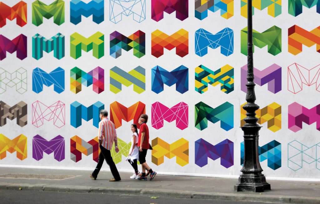
Corporate colors are present in most cases but not always. Take a look at the corporate style of Melbourne (yes, the city one):

The sign shape is steady, while the colors verify significantly. This technique is used when a multifunctional corporate style is necessary – for example, when it’s hard to get by with a few colors to decorate all city authorities.
In most cases, there is one defined corporate color but sometimes even two, three, or four. A single corporate color is usually of medium intensity so that it can be used on both black and white backgrounds. If there are a few colors, they are generally different in tone to make logo inversions:

Color is a powerful psychological weapon. Colorful spots catch customers’ attention more easily than a word or an image. However, the more colors a corporate style has, the more complicated their combination principles become. Thus, most logos are limited to two or three colors.
Patterns and Textures
Not every company logo has patterns and textures. Sometimes, additional graphics are required for the design of places, packaging, advertising banners, and other information carriers. Seamless patterns and textures are more popular because they are simple to use in any format and any size.
Patterns consist of a few repeating elements. Textures are photorealistic images that can be used as a background.
Carrier Design

Corporate style carriers are merch, websites, application interfaces, social media posts, goods packaging, business cards, flyers, facility walls, and employee uniforms. All company attributes carry the corporate style one way or another.
Additional graphic elements, modular grid, layouts for printing on paper or website pages: all of these compose carrier design. Sometimes, product branding is limited to logo placement only, but many carriers require an individual design based on their shape, size, and purpose.
Final Thoughts
Corporate style is how the company presents itself to the outside world. It can be limited to a logo with a corporate font and color or can include patterns, textures, and different product designs. Visual images help quickly identify and remember the brand, and they create a definite attitude not only for clients but for employees and company partners, as well.
Need to develop a corporate style from the scratch or do a rebranding? See our portfolio and schedule a call.
Did You Like This Article?
Our Other Articles
 17 mins read
Healthcare PPC: Guidelines and Best Practices in Medical Advertising for 2024
Healthcare PPC Best Practices
 23 mins read
Healthcare SEO: Top SEO Strategies for Medical Practices in 2024
The Ultimate Guide to Healthcare SEO
 15 mins read
10 Best Dental Marketing Agencies for 2024
Best Dental Marketing Agencies
 15 mins read
Top 10 Insurance Marketing Agencies for 2024
Best Insurance Marketing Agencies
 13 mins read
10 Presentation Design Agencies to Look Out for 2024
Presentation Design Agencies
 12 mins read
8 Best Integrated Marketing Agencies in 2024
Best Integrated Marketing Agencies
- How Luxora works
- How you can do marketing at scale better, faster and cheaper
- How we’re different from agencies, freelancers and in-house marketing teams (hint: we’re 15x faster than hiring!)
- The most suitable subscription plan for your needs


